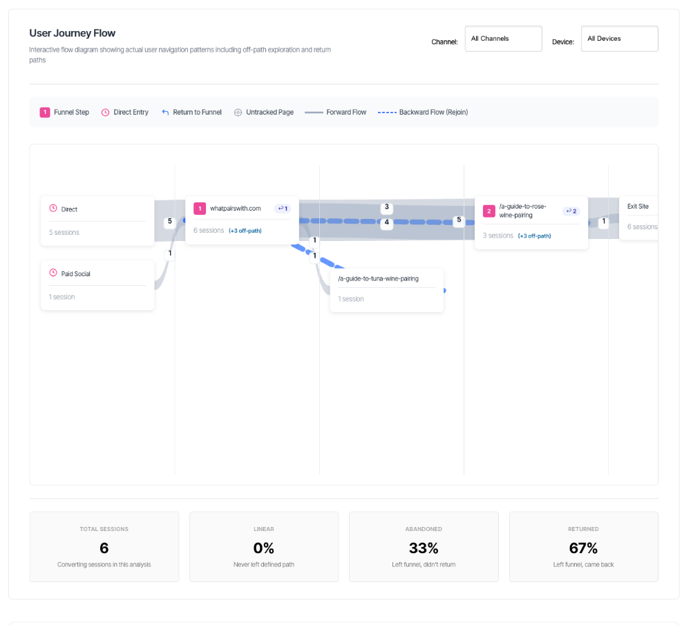
User Journey Flow
The User Journey Flow is an interactive visualisation that reveals the navigation patterns of your visitors – including when they explore pages outside your defined conversion path and whether they return. Unlike the simple funnel chart that shows only the happy path, this diagram shows the messy reality of how people actually browse your site.
What You'll See
When you select a conversion path, the User Journey Flow displays:
- Swim lanes organised from left to right showing different stages of the journey
- Node boxes representing pages or entry points, sized by session volume
- Flow paths (curved lines) showing how sessions move between nodes
- Entry points on the left (how visitors start their journey)
- Exploration zones showing off-path behaviour
- Return paths (dashed lines) showing when visitors rejoin the funnel
- Exit point on the right (when visitors leave your site)
- Summary statistics below the diagram
The chart updates based on your filter selections and includes dedicated Channel and Device filters for deeper analysis.
Understanding the Layout
Swim Lane Organisation
The diagram is organised into vertical columns (swim lanes) that represent different stages and behaviours:
Entry Points (Far Left)
- Where visitors begin their journey
- In cookie tracking mode: Shows traffic sources (Organic Search, Paid Search, Email, etc.)
- In cookieless mode: Shows first pages visited
- Purpose: Understand where your traffic originates
Step Lanes
- Your defined conversion path steps in order
- Step 1, Step 2, Step 3, etc.
- These are the pages you've configured as your funnel
- Purpose: Show progression through your intended path
Exploration Lanes (Beside Each Step)
- Appear between step lanes when visitors go off-path
- Show pages visited outside your defined funnel
- Purpose: Reveal where visitors wander when they leave your path
Return Lanes
- Appear between step lanes when visitors return
- Labelled "Return"
- Show the specific pages visitors were on before rejoining
- Purpose: Understand how visitors find their way back
Exit (Far Right)
- Final destination when visitors leave your site
- Everyone ends up here eventually
- Purpose: Shows total session endings
Visual Hierarchy
Top to Bottom Within Lanes: Nodes are ordered by session volume, with the busiest pages at the top.
Left to Right Across Lanes: Represents the chronological flow of the user journey from entry to exit.
Node Types Explained
1. Funnel Step Nodes (Pink with Numbers)
Appearance:
- Pink/magenta colour
- Numbered badge (1, 2, 3, etc.) matching your funnel steps
- URL or friendly name as the label
- Session count displayed
What they represent: Your defined conversion path steps – the pages you want visitors to follow.
Example:
┌─────────────────────────┐
│ 1 Product Page          │
│ 247 sessions           │
└─────────────────────────┘
Interpretation: 247 sessions reached Step 1 (Product Page) during the analysis period.
Additional badges:
- ↩︎ Return badge (top right): Shows how many sessions returned to this step after exploring off-path
- Off-path notice (in stats): Shows sessions that visited this URL whilst off-path, now merged
2. Direct Entry Nodes (Clock Icon)
Appearance:
- Clock icon
- Channel name (e.g., "Organic Search", "Paid Search", "Direct")
- Session count
What they represent: The traffic source that brought visitors to your site. Only visible in cookie tracking mode.
Example:
┌─────────────────────────┐
│ 🕐 Paid Search          │
│ 142 sessions           │
└─────────────────────────┘
Interpretation: 142 sessions entered via paid search campaigns.
Why it matters: Understanding which channels drive traffic helps you allocate marketing budget and optimise campaigns.
3. Off-Path Nodes (No Special Icon)
Appearance:
- URL label
- Session count
- May have "untracked" indicator if the page isn't in your tracking system
What they represent: Pages visited outside your defined conversion funnel – where visitors go when they explore.
Example:
┌─────────────────────────┐
│ /about-us               │
│ 89 sessions            │
└─────────────────────────┘
Interpretation: 89 sessions visited your About Us page after leaving the defined funnel steps.
Why they appear: Visitors often need additional information before converting. Off-path exploration isn't necessarily bad – it shows research behaviour or the funnel is not what you anticipated.
4. Return Nodes (Blue Arrow Icon)
Appearance:
- Blue arrow icon (↰)
- URL label
- Sometimes includes a step number badge
- Session count
What they represent: The specific pages visitors were viewing when they decided to rejoin your conversion funnel.
Example:
┌─────────────────────────┐
│ ↰ 3 /pricing            │
│ 34 sessions            │
└─────────────────────────┘
Interpretation: 34 sessions returned to Step 3 after visiting the pricing page. They left the funnel, checked pricing, then came back.
Why it matters:
- Shows which content successfully brings visitors back
- Identifies valuable supporting pages
- Reveals the information visitors need before progressing
5. Untracked Page Nodes (Compass Icon)
Appearance:
- Compass/target icon (⊕)
- Grey colouring
- URL label
- Session count
What they represent: Pages on your domain that aren't set up in your tracking system.
Example:
┌─────────────────────────┐
│ ⊕ /new-product-launch   │
│ 23 sessions            │
└─────────────────────────┘
Interpretation: 23 sessions visited a page that exists on your site but isn't configured for tracking. You're seeing it in the flow because visitors went there, but you don't have detailed analytics for it.
Action required: Consider adding these pages to your tracking configuration if they're important to your conversion process.
6. Summary Nodes (Ellipsis Icon)
Appearance:
- Three dots icon (•••)
- Label like "+12 more pages"
- Grey colouring
What they represent: A collapsed group of less-frequently visited off-path pages.
Why they exist: To keep the diagram readable, only the top 3 most-visited off-path pages per step are shown individually. Everything else is grouped into summary nodes.
Example:
┌─────────────────────────┐
│ ••• +15 more pages      │
│ 87 sessions            │
└─────────────────────────┘
Interpretation: 87 sessions visited 15 different off-path pages that aren't shown individually. These are lower-traffic exploration pages.
7. Exit Node (Far Right)
Appearance:
- Grey colouring
- "Exit Site" label
- Total sessions count
What it represents: The final destination for all sessions – when visitors leave your website entirely.
Example:
┌─────────────────────────┐
│ Exit Site               │
│ 891 sessions           │
└─────────────────────────┘
Interpretation: 891 sessions ended (left your site) during the analysis period.
Note: This number should roughly match your total session count, as every session eventually ends.
Understanding the Flow Paths
Forward Flow Paths (Solid Lines)
Appearance:
- Solid, curved lines
- Varying widths based on volume
- Different colours based on path type:
- Grey: General movement (step to step, entry to step)
- Blue: Off-path exploration (touching exploration nodes)
- Pink: Funnel progression (step to step within the path)
What they represent: The direction and volume of traffic flowing from one node to another in chronological order (left to right).
How to read them:
- Thickness = Volume of sessions taking this path (thicker = more sessions)
- Labels = Exact session count on each path
- Direction = Always flows left-to-right (forward in time)
Example: A thick grey line from "Organic Search" to "Step 1" with label "124" means: 124 sessions entered via organic search and landed on Step 1.
Backward Flow Paths (Dashed Lines)
Appearance:
- Dashed/dotted blue lines
- Flow from right to left (against the normal direction)
- May appear to curve backwards
What they represent: Return journeys – when visitors who explored off-path successfully rejoin the conversion funnel.
How to read them: These show the "comeback" story. A visitor left the funnel, explored other pages, then found their way back to continue the conversion process.
Example: A dashed blue line flowing from an off-path node back to "Step 2" means: Sessions left the funnel after Step 1, visited the off-path page, then returned to Step 2 to continue.
Why they're important:
- Show your content is successfully nurturing visitors
- Indicate which supporting pages help conversions
- Prove that exploration isn't always abandonment
Path Width and Volume
Minimum Width: Very thin paths (3 pixels) represent low-volume connections.
Maximum Width: Very thick paths (up to 80 pixels) represent high-volume connections.
Labels: Every path shows its exact session count in a white badge along the path.
Interpretation: Don't just look at colours – path thickness gives you an instant visual sense of where most traffic flows.
Summary Statistics Explained
Below the diagram, you'll see four key metrics in cards:
1. Total Sessions
Shows: Total number of sessions analysed in the diagram.
What it means: This is your baseline – how many visitor sessions are represented in the entire visualisation.
Example: "247 sessions"
Note: In cookie tracking mode, this counts sessions with full identity tracking. In cookieless mode, it's all sessions.
2. Linear Percentage
Label: "Linear"
Shows: Percentage of sessions that never left the defined path.
What it means: These are your "straight-through" visitors who entered at Step 1, proceeded through Steps 2, 3, 4, etc., without ever visiting an off-path page.
Example: "34%"
Interpretation: 34% of visitors followed your intended path exactly, without any exploration or deviation.
Good or bad?
- Higher %: Efficient funnel, clear path, or possibly limited content
- Lower %: More exploration, possibly indicates unclear path or need for supporting content
3. Abandoned Percentage
Label: "Abandoned"
Shows: Percentage of sessions that left the funnel and never returned.
What it means: These visitors explored off-path pages and then exited your site without completing the conversion path.
Example: "43%"
Interpretation: 43% of visitors who entered your funnel later left it to explore other pages and didn't come back before leaving your site.
This is concerning when:
- Percentage is very high (>60%)
- It's increasing over time
- Combined with low conversion rates
Common causes:
- Confusing funnel steps
- Missing information
- Unexpected costs or requirements
- Better alternatives found elsewhere
- Poor mobile experience
4. Returned Count
Label: "Returned"
Shows: Percentage of sessions that left the funnel but successfully returned to continue.
What it means: These are your "boomerang" visitors – they explored off-path content and then found their way back to complete (or attempt to complete) the conversion process.
Example: "23%"
Interpretation: 23% of visitors temporarily left the funnel to explore, but your content successfully brought them back.
This is positive when:
- Percentage is significant (>15%)
- It's increasing over time
- Conversion rate is also healthy
What it reveals:
- Your supporting content is working
- Visitors need additional information before converting
- Your site structure helps people navigate back
- You have effective internal linking
Understanding the Three Categories
Important: These three categories are mutually exclusive. Every session falls into exactly one category:
- Linear: Stayed in the funnel the entire time
- Abandoned: Left the funnel and didn't return
- Returned: Left the funnel but came back
They should sum to 100% (give or take rounding): Linear (34%) + Abandoned (43%) + Returned (23%) = 100%
The Legend (Visual Guide)
At the top of the diagram, you'll see a legend explaining the visual elements:
1 Funnel Step
- Numbered badge in pink
- Your defined conversion path
🕐 Direct Entry
- Clock icon
- Traffic source (cookie mode)
↰ Return to Funnel
- Blue arrow
- Rejoin points
⊕ Untracked Page
- Compass icon
- Pages not in tracking
─── Forward Flow
- Solid grey line
- Chronological movement
┈┈┈ Backward Flow (Rejoin)
- Dashed blue line
- Return paths
Using the Dedicated Filters
The User Journey Flow has its own filters separate from the main dashboard filters. These allow you to slice the flow data without affecting other charts.
Channel Filter
Location: Top-right of the flow section
Purpose: Filter the entire flow diagram to show only sessions from a specific traffic source.
Options:
- All Channels (default)
- Organic Search
- Paid Search
- Direct
- Social
- Referral
- Other channels from your tracking
When to use:
- Compare quality of different marketing channels
- Understand if paid traffic behaves differently than organic
- Identify which sources lead to more exploration
- Optimise channel-specific landing pages
Example scenario: Select "Paid Search" to see:
- Do paid visitors follow a more linear path?
- Which off-path pages do paid visitors explore?
- Are paid visitors more likely to return after exploration?
Note: Only available in cookie tracking mode. If your domain uses cookieless tracking, this filter won't appear.
Device Filter
Location: Top-right of the flow section, next to Channel filter
Purpose: Filter the flow to show only mobile, desktop, or tablet sessions.
Options:
- All Devices (default)
- Desktop
- Mobile
- Tablet
When to use:
- Compare mobile vs desktop user behaviour
- Identify device-specific issues
- Understand if mobile users explore more
- Optimise for specific device experiences
Example scenario: Select "Mobile" to see:
- Do mobile users leave the funnel more often?
- Which pages do mobile users visit when off-path?
- Is the mobile return rate lower than desktop?
- Should you simplify the mobile funnel?
Combining Filters
You can use both filters together for powerful segmentation:
Examples:
- Paid Search + Mobile: How do mobile visitors from paid ads navigate?
- Organic + Desktop: What's the desktop organic user journey?
- Email + Mobile: Are email campaigns mobile-optimised?
Reading Real-World Patterns
Pattern 1: The Clean Funnel
Visual appearance:
- Thick paths connecting steps 1→2→3→4
- Few or no exploration lanes
- High linear percentage (40%+)
- Most paths are grey (direct progression)
What it means: Your funnel is working efficiently. Visitors understand the path, find what they need, and convert without needing supporting content.
Pattern 2: The Researcher's Journey
Visual appearance:
- Multiple exploration lanes with significant traffic
- Many blue off-path connections
- Moderate abandoned percentage (30-50%)
- Good return percentage (20%+)
- Dashed return lines present
What it means: Visitors need additional information before converting. They're exploring your content, and many successfully return to complete the path.
Pattern 3: The Leaky Funnel
Visual appearance:
- Large exploration lanes
- Thick paths to exit node from exploration zones
- High abandoned percentage (50%+)
- Low return percentage (<10%)
- Few or no dashed return lines
What it means: Visitors are leaving your funnel and not coming back. The off-path pages aren't successfully nurturing them toward conversion.
Pattern 4: The Confused Visitor
Visual appearance:
- Many untracked page nodes (compass icons)
- Scattered flow with no clear dominant paths
- Exploration and return volumes roughly equal
- Multiple paths between every step
What it means: Visitors aren't following a clear journey. They're bouncing around your site trying to find what they need.
Pattern 5: The Entry Problem
Visual appearance:
- Multiple direct entry nodes (channels)
- Different entry channels show very different flow patterns
- One channel has thick paths to exit shortly after entry
What it means: Different traffic sources are sending different-quality visitors. Some channels bring visitors who immediately leave.
Pattern 6: The Return Champion
Visual appearance:
- Specific off-path page has many dashed return lines
- High return percentage to subsequent steps
- One or two pages dominate the exploration zone
What it means: Specific content is successfully nurturing visitors and bringing them back. These are your "conversion enabler" pages.
Practical Use Cases
Use Case 1: Identifying Content Gaps
Scenario: You notice many sessions abandoning after Step 2 and visiting pricing-related pages.
How to analyse:
- Click on the pricing node in the exploration lane
- Note the session volume
- Check if there are return paths from pricing back to the funnel
- If few returns: pricing page isn't helping people continue
Diagnosis: Visitors need pricing information earlier in the journey, but your current pricing page doesn't successfully guide them back.
Use Case 2: Mobile vs Desktop Behaviour
Scenario: Your overall conversion rate is declining, but you're not sure why.
How to analyse:
- View flow with "All Devices" first (baseline)
- Select "Mobile" filter
- Select "Desktop" filter
- Compare the two flows
What to look for:
- Do mobile users have higher abandoned percentage?
- Are mobile exploration lanes busier?
- Do mobile users visit different off-path pages?
- Is the mobile return rate lower?
Example finding: Mobile abandoned rate: 62% Desktop abandoned rate: 31%
Diagnosis: Mobile experience is causing abandonment.
Use Case 3: Channel Quality Assessment
Scenario: You're spending heavily on paid search but want to ensure it's driving quality traffic.
How to analyse:
- Select "Paid Search" in Channel filter
- Note the linear percentage
- Check abandoned percentage
- Compare to "Organic Search"
Example findings:
Paid Search:
- Linear: 18%
- Abandoned: 67%
- Returned: 15%
Organic:
- Linear: 41%
- Abandoned: 34%
- Returned: 25%
Diagnosis: Paid search is bringing lower-quality traffic that abandons more frequently and explores more before (sometimes) converting.
Use Case 4: Optimising Supporting Content
Scenario: You want to know which blog posts help conversions.
How to analyse:
- Look at exploration lanes for blog post URLs
- Identify blog posts with dashed return lines
- Note the session counts and return rates
- Compare to blog posts with no return lines
Example findings:
- "/blog/ultimate-buying-guide" → 89 sessions, 34 returns
- "/blog/company-history" → 23 sessions, 1 return
- "/blog/how-to-use-product" → 156 sessions, 67 returns
Diagnosis:
- Buying guide and how-to content successfully nurture visitors
- Company history doesn't help conversions
- How-to guide is most effective (43% return rate)
Use Case 5: Funnel Step Sequencing
Scenario: You suspect your funnel steps might be in the wrong order.
How to analyse:
- Look for "backward" flows between funnel steps (not just off-path returns)
- Check if visitors frequently skip steps
- Note if certain steps have unusually high abandonment
Example findings:
- Many sessions skip from Step 2 directly to Step 4
- Step 3 has very low traffic relative to Steps 2 and 4
- Exploration after Step 3 is much higher than other steps
Diagnosis: Step 3 might be unnecessary or inappropriately placed. Visitors either skip it or it causes confusion.
Important Information Notice
Below the summary statistics, you may see an information banner:
Message: "Note: Path edge values show flow volume. Returns create multiple edges, so edge totals may exceed unique sessions."
What This Means
Edge Values vs Session Counts:
Session counts (on nodes) = Unique sessions that visited that page
Edge values (on paths) = Number of times sessions followed that specific route
Why They Differ
When a visitor explores off-path and returns, they create multiple edges:
Example:
- Session enters at Step 1
- Goes to off-path page
- Returns to Step 2
This creates three edges:
- Step 1 → Off-path (value: 1)
- Off-path → Step 2 (value: 1)
- Could also have: Entry → Step 1 (value: 1)
But it's still only one session.
What This Means for Analysis
Valid:
- "89 sessions visited this off-path page"
- "This step received 247 sessions"
Invalid:
- Don't sum all edge values and expect it to equal total sessions
- Don't compare edge sums across different parts of the diagram
Correct interpretation: Focus on node session counts for volume metrics, and edge values for understanding specific paths taken.
Cookie Tracking vs Cookieless Mode
The flow diagram works differently depending on your domain's tracking mode:
Cookie Tracking Mode (Full Features)
What you get:
- Channel entry nodes (traffic source visibility)
- Dedicated Channel filter
- Full visitor journey tracking
- Return path identification
- Complete off-path analysis
How it works: Uses visitor IDs to track complete journeys across sessions, enabling full attribution and return path detection.
Visual indicators:
- Multiple direct entry nodes showing traffic sources
- Channel filter dropdown is visible
- Dashed return lines present
Cookieless Mode (Privacy-Focused)
What you get:
- Session-level tracking only
- Limited journey visibility
- No channel attribution
- Basic flow analysis
Limitations:
- No channel entry nodes
- Channel filter is hidden
- Return paths may be incomplete
- Single-session scope
Visual indicators:
- First-page entry nodes instead of channel nodes
- No Channel filter visible
- Fewer return paths detected
Why this mode exists: Respects visitor privacy by not using cross-session tracking cookies, suitable for privacy-focused organisations or certain jurisdictions.
Understanding Session-Level Counting
All metrics in the User Journey Flow use session-level counting, consistent with the rest of your dashboard.
What This Means
Session = One Visit A session is a single visit to your website, regardless of how long it lasts or how many pages are viewed.
Counted Once: Each session is counted once per node it visits, even if it visits that page multiple times within the session.
Example: Visitor journey:
- Enters site (1 session starts)
- Views product page
- Leaves to check reviews
- Returns to product page (same session)
- Adds to cart
- Completes purchase
- Leaves site (1 session ends)
Node counts:
- Product page: 1 session
- Off-path review page: 1 session
- Cart page: 1 session
- Purchase: 1 session
Even though the product page was viewed twice, it counts as 1 session.
Troubleshooting Common Issues
Issue: Diagram Not Showing
Symptom: Empty placeholder or "Select a path" message
Causes:
- No path selected in filters
- No domain selected in filters
Solution:
- Ensure a domain is selected in the main filter bar
- Ensure a path is selected in the main filter bar
- Wait for data to load (spinner will appear)
Issue: "No Flow Data Available"
Symptom: Message appears after filters are set
Causes:
- No sessions entered this path during the date range
- Date range too short for meaningful data
- Path recently created with no historical data
Solution:
- Extend date range (try 30 or 60 days)
- Verify the path has actual traffic
- Check if path was active during selected period
- Confirm tracking is working correctly
Issue: Only Seeing One or Two Nodes
Symptom: Very sparse diagram with minimal connections
Causes:
- Very low traffic volume
- Extremely linear behaviour (rare)
- Tracking configuration issues
- Filters too restrictive
Solution:
- Check total sessions in summary stats
- Remove channel or device filters
- Extend date range
- Verify tracking is capturing pageviews
Issue: Many Untracked Page Nodes
Symptom: Lots of compass icons (⊕) in the diagram
Causes:
- Pages exist on your site but aren't configured for tracking
- New pages added recently
- Dynamic URLs not properly configured
Solution:
- Review your tracking configuration
- Add important pages to your tracking system
- Consider URL patterns for dynamic content
- Contact support if you need help with tracking setup
Issue: No Channel Filter Visible
Symptom: Device filter appears but not Channel filter
Causes:
- Domain is in cookieless tracking mode
- No channel data available for this period
Explanation: This is expected behaviour for cookieless tracking. Channel attribution requires cross-session visitor tracking.
Solution:
- No action needed if intentional
- If you need channel attribution, enable cookie tracking for the domain
- Change tracking mode
Issue: Very High Abandoned Percentage (>70%)
Symptom: Most sessions abandon without returning
Diagnosis: This is a significant user experience or funnel design issue.
Issue: Percentages Don't Sum to 100%
Symptom: Linear + Abandoned + Returned ≠ 100%
Causes:
- Rounding (acceptable if within 1-2%)
- Data processing issue (if difference is >5%)
Solution:
- If <2% difference: Ignore, it's rounding
- If 2-5% difference: Acceptable variance
- If >5% difference: Contact support with screenshot
Issue: Diagram Performance/Slow Loading
Symptom: Diagram takes a long time to render or browser becomes sluggish
Causes:
- Very high traffic volume
- Long date range (90-120 days)
- Many exploration paths
- Browser limitations
Solution:
- Reduce date range (try 30 days instead of 90)
- Apply device or channel filters to segment
- Close other browser tabs
- Try a different browser
Frequently Asked Questions
Q: Why do edge values sum to more than total sessions?
A: Because returning visitors create multiple edges. One session can follow multiple paths if it explores and returns.
Example: Entry → Step 1 → Off-path → Step 2 = 3 edges, 1 session.
Focus on node session counts for volume, edge values for specific routes.
Q: What's the difference between this and the funnel chart?
A:
Funnel chart:
- Shows only your defined path
- Displays drop-off rates between steps
- Simple, linear visualisation
- Entry → Step 1 → Step 2 → Step 3 → Exit
User Journey Flow:
- Shows actual navigation including off-path exploration
- Reveals where people go when they leave your path
- Shows return behaviour
- Complex, realistic visualisation
- Multiple paths, explorations, returns
Use funnel for: Quick health check, drop-off identification
Use flow for: Understanding why drops occur, optimising the full experience
Q: How do I know if my exploration rate is too high?
A: There's no universal "too high". Context matters:
Consider exploration rate too high when:
- Abandoned percentage >60%
- Return percentage <10%
- Conversion rate is declining
- Off-path pages are non-product related (help, policies, complaints)
Exploration rate might be healthy when:
- Return percentage is 20%+
- Conversion rate is stable or increasing
- Off-path pages are product comparisons, specifications, reviews
- Higher-consideration products
Rule of thumb: Linear (30-40%) + Returned (20-30%) = 50-70% successful sessions is healthy for most businesses.
Q: Should I try to eliminate all exploration?
A: No! Exploration is often necessary and beneficial:
Benefits of exploration:
- Visitors researching and educating themselves
- Building trust through testimonials/reviews
- Comparison shopping (staying on your site vs leaving)
- Gathering information needed to convert
Goal: Not to eliminate exploration, but to ensure exploration leads to conversion (high return rate) rather than abandonment.
Focus on:
- Making it easy to return from off-path pages
- Ensuring off-path content supports conversion
- Providing clear next steps from exploration pages
Q: How far back can I analyse?
A: Based on your date range filter:
- 7 days for quick recent checks
- 30 days for reliable patterns (recommended)
- 60 days for seasonal comparisons
- 90-120 days for long-term trends
Note: Longer date ranges = more data = slower rendering.
Stick to 30-60 days for most analysis.