Journey Start vs Conversion Device Chart
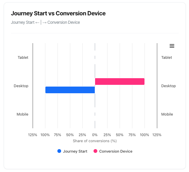
The Journey Start vs Conversion Device chart (also called a "butterfly chart") reveals one of the most important patterns in modern customer behaviour: device switching. This visualisation shows which devices people use when they first discover you, and which devices they ultimately use to convert – revealing the true nature of your omnichannel customer journey.
What You'll See
The chart displays a unique horizontal bar layout that extends both left and right from a centre line:
Left Side (Journey Start):
- Shows which device visitors used for their very first touchpoint
- Bars extend to the left (negative direction)
- Represents the discovery or awareness stage
- Blue colour
Right Side (Conversion Device):
- Shows which device visitors used when they converted
- Bars extend to the right (positive direction)
- Represents the final decision or purchase stage
- Pink colour
Three Device Categories:
- Mobile
- Desktop
- Tablet
Percentage Distribution:
- Each side totals 100%
- Shows relative share of each device
- Allows direct comparison between journey start and conversion
Understanding the Butterfly Format
The Visual Structure
Central Axis (Vertical Grey Line)
- Divides the chart into two halves
- Left side = Journey Start
- Right side = Conversion Device
- The meeting point in the middle
Horizontal Bars
- Extend left OR right from the centre
- Three rows representing device types
- Bar length = percentage of that device type
- Different colours for each side (blue vs green)
Reading Direction
Left Side (Blue) - Journey Start:
- Shows the device type of the FIRST touch
- Where customers initially discovered you
- The beginning of their journey
- Bars extend LEFT from centre
Right Side (Pink) - Conversion Device:
- Shows the device where conversion happened
- The FINAL touchpoint in the journey
- Where they completed their purchase/signup
- Bars extend RIGHT from centre
The Three Device Categories
Mobile
Characteristics:
- Smartphones of any size
- On-the-go browsing
- Quick, convenient access
Typical Behaviours:
- Discovery and initial research
- Quick price checks
- Reading reviews while shopping
- Impulse purchases for simple products
Strengths:
- Always available
- Immediate access
- Location-based relevance
- Growing market share
Limitations:
- Smaller screen for comparison
- More difficult form entry
- Less suitable for complex decisions
- May lack full feature access
Desktop
Characteristics:
- Traditional computers (Mac, PC)
- Full keyboard and mouse
- Larger screens
- Often home or office setting
Typical Behaviours:
- Detailed research and comparison
- Complex form completion
- Higher-value purchases
- Multiple-tab comparison shopping
Strengths:
- Full website functionality
- Easy form completion
- Better for detailed comparison
- Comfortable for long sessions
Limitations:
- Less convenient (not portable)
- Limited to specific locations
- Declining market share
- Younger audiences prefer mobile
Tablet
Characteristics:
- iPad, Android tablets
- Touch interface like mobile
- Screen size between mobile and desktop
- Often leisure/evening usage
Typical Behaviours:
- Casual browsing
- Evening research (couch browsing)
- Content consumption
- Hybrid of mobile and desktop patterns
Strengths:
- Comfortable for extended viewing
- Touch interface simplicity
- Portable like mobile
- Larger screen than phones
Limitations:
- Smaller user base
- Often forgotten in optimisation
- May render mobile or desktop versions
- Less common for transactions
Common Patterns and What They Mean
Pattern 1: Mobile Discovery, Desktop Conversion
Visual:
- High mobile on left (50-60%)
- High desktop on right (60-70%)
- Mobile drops significantly right side
- Desktop increases significantly right side
What's happening:
Customer Journey:
1. Discover your site on mobile (commute, lunch break)
2. Research on mobile initially
3. Switch to desktop for detailed comparison
4. Complete purchase on desktop (larger screen, keyboard)
Why it happens:
- Mobile convenient for discovery
- Desktop better for detailed evaluation
- Complex forms easier on desktop
- Higher-value purchases feel safer on desktop
- Customers have established this habit
Typical products:
- Mid to high-value items (£100+)
- Complex comparisons (insurance, software)
- Form-heavy conversions (applications, registrations)
- B2B services
What to do:
- Optimise mobile for research:
- Rich product information
- Easy-to-read specs
- Good mobile UX for comparison
- Optimise desktop for conversion:
- Streamlined checkout
- Trust signals prominent
- All information readily available
- Ensure cross-device continuity:
- Save cart across devices
- Allow bookmarking/saving
- Email reminder options
- Account-based tracking
- Don't neglect mobile conversion:
- 20% still converting on mobile
- Could capture more with optimisation
- Test mobile checkout improvements
Pattern 2: Desktop Discovery, Mobile Conversion
Visual:
- High desktop on left (50-60%)
- High mobile on right (50-60%)
- Desktop drops on right side
- Mobile increases on right side
What's happening:
Customer Journey:
1. Research at work/home on desktop
2. Thorough evaluation phase
3. Return later on mobile to complete
4. Convert during convenient moment
Why it happens:
- Initial research during "desk time"
- Decision made, just need to complete
- Mobile more convenient for final step
- Trust already established
Typical products:
- Simple checkout process
- Products researched but quickly bought
- Subscription services
- Event tickets or bookings
What to do:
- Desktop as education platform:
- Detailed product information
- Comparison tools
- Educational content
- Mobile as conversion platform:
- Super-simple checkout
- Saved payment methods
- One-click purchase options
- Apple Pay, Google Pay
- Cross-device handoff:
- "Complete purchase on mobile" CTAs
- Email/SMS purchase links
- QR codes for mobile handoff
Pattern 3: Mobile Dominance Both Sides
Visual:
- High mobile on left (60-70%)
- High mobile on right (60-70%)
- Desktop and tablet minimal both sides
- Symmetrical mobile pattern
What's happening:
Customer Journey:
1. Discover on mobile
2. Research on mobile
3. Convert on mobile
4. Complete mobile-only journey
Why it happens:
- Mobile-first audience
- Simple purchase decision
- Excellent mobile experience
- Low-friction mobile checkout
Typical products:
- Apps and digital services
- Low-value impulse items
- Mobile-native businesses
- Younger demographics
What to do:
- Prioritise mobile above all:
- Mobile-first design approach
- Lightning-fast mobile performance
- Touch-optimised interface
- Don't abandon desktop:
- 30-40% still research there
- May influence mobile conversion
- Brand perception matters
- Leverage mobile advantages:
- Location-based features
- Camera integration
- Push notifications
- App-like web experience
Pattern 4: Desktop Dominance Both Sides
Visual:
- High desktop on left (60-70%)
- High desktop on right (60-70%)
- Mobile and tablet minimal
- Symmetrical desktop pattern
What's happening:
Customer Journey:
1. Desktop-first audience
2. Research on desktop
3. Convert on desktop
4. Complete desktop-only journey
Why it happens:
- B2B audience (work computers)
- Complex product requiring desktop
- Enterprise buyers
- Professional/work-related purchases
Typical products:
- B2B software
- Enterprise services
- Professional tools
- Complex financial products
What to do:
- Optimise desktop experience:
- Rich, detailed content
- Advanced comparison tools
- Professional design
- Consider mobile for stakeholders:
- Decision-makers may review on mobile
- Mobile-responsive design still essential
- Mobile for follow-up and communication
- Focus on desktop conversion:
- Detailed proposals/quotes
- Live chat for support
- Screen-share capabilities
Pattern 5: Tablet as Bridge Device
Visual:
- Moderate tablet on left (30-40%)
- Lower tablet on right (15-20%)
- Tablet starts journey, finishes elsewhere
What's happening:
Customer Journey:
1. Evening browsing on tablet
2. Casual research phase
3. Switch to mobile or desktop to complete
4. Tablet as discovery, not completion
Why it happens:
- Tablet for leisure browsing
- Not always convenient for checkout
- Used in relaxed, exploratory mode
- Switch to more convenient device to complete
What to do:
- Tablet for engagement:
- Beautiful visual presentation
- Content-rich experience
- Video and imagery emphasis
- Expect device switching:
- Save progress features
- Email cart/favourites
- Easy handoff to other devices
- Don't over-optimise tablet:
- Smaller audience
- Often renders mobile/desktop versions well
- Focus resources on mobile/desktop
Pattern 6: Extreme Switching (Research-Heavy)
Visual:
- Mobile 70%+ on left
- Desktop 80%+ on right
- Massive device switching visible
What's happening:
Customer Journey:
1. Extensive mobile research
2. Multiple sessions browsing mobile
3. Decision nearly made
4. Final conversion strongly prefers desktop
Why it happens:
- Very high-value purchase
- Complex decision requiring reassurance
- Trust concerns resolved on desktop
- Forms too complex for mobile
What to do:
- Address mobile barriers:
- Why aren't they converting on mobile?
- Is checkout too complex?
- Trust signals missing on mobile?
- Test mobile improvements:
- Simplified mobile checkout
- Mobile payment options (Apple Pay)
- Reduced form fields
- Capture more mobile conversions:
- Even 10% shift = significant revenue
- Mobile traffic is highest volume
- Low-hanging optimisation fruit
Understanding the Session-Level Counting
Important: This chart uses session-level counting, meaning:
What's counted:
- Each converting session counted once
- Journey Start = device of first touch in that session's journey
- Conversion Device = device where conversion happened
Why it matters:
- Aligns with all other dashboard metrics
- Shows actual customer behaviour patterns
- More accurate than event-level counting
Example:
- Customer has 5 sessions before converting
- Sessions 1-4: Mobile
- Session 5: Desktop (conversion occurs)
- Chart shows: Journey Start = Mobile, Conversion = Desktop
Troubleshooting
Issue: Chart Shows "No conversions found"
Possible causes:
- Filters too restrictive:
- Remove campaign filter
- Try broader date range
- Check path selection
- No conversions in period:
- Verify in KPI dashboard
- Check tracking working
- Confirm date range has activity
- Cookie tracking disabled:
- Chart hidden in cookieless mode
- Check domain settings
- This chart requires cookie tracking
Issue: Patterns Seem Unrealistic
Validation steps:
- Check tooltip numbers:
- Are actual counts reasonable?
- Percentages can be misleading with small samples
- Need 100+ conversions for reliable patterns
- Compare to traffic distribution:
- Journey Start should roughly match traffic sources
- If 90% mobile traffic, expect 80-90% mobile starts
- Review tracking configuration:
- Is device detection working correctly?
- Are tablets being grouped with mobile?
- Check for bot traffic
- Consider segment bias:
- Path-specific patterns may differ
- Campaign-specific audiences behave differently
- Date range may capture unusual period
Issue: High Tablet Percentage
Possible explanations:
- Tablet actually popular:
- Your audience uses tablets
- Content consumption focus
- Evening/leisure browsing
- Tracking classification issue:
- Some mobiles classified as tablets
- iPad mini vs iPad categorisation
- Check device detection logic
- Specific campaign or source:
- Apple News drives tablet traffic
- Tablet-specific ad placement
- Email viewed on iPads
Validation: Check tablet percentage in other analytics tools (Google Analytics). Should be similar.