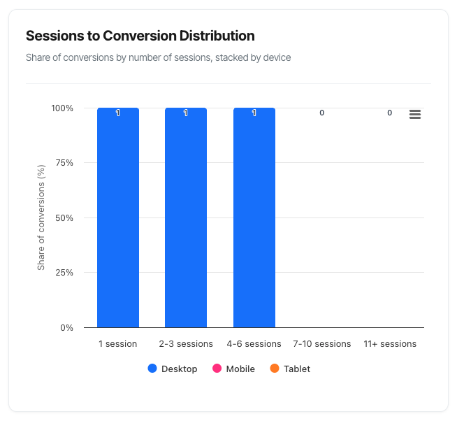
Sessions to Conversion Distribution Chart
The Sessions to Conversion Distribution chart reveals how many sessions (visits) it takes for your visitors to complete a conversion. This shows whether people convert immediately, or if they need multiple visits to make a decision – and which devices they use throughout their journey.
What You'll See
The chart displays a stacked column graph with five categories showing conversion patterns:
- Five columns representing different journey lengths (1 session, 2-3 sessions, etc.)
- Stacked segments within each column showing device types (Desktop, Mobile, Tablet)
- Percentage distribution adding up to 100% across all columns
- Colour coding to distinguish between device types
- Interactive tooltips revealing detailed counts and breakdowns
The chart updates automatically when you change your filters, helping you understand conversion behaviour across different segments.
Chart Structure
The Five Conversion Buckets
The horizontal axis shows five categories representing the number of sessions required to convert:
1 Session
- Visitors who converted during their first visit
- "Impulse converters" or immediate decisions
- No research or consideration period needed
- Fast decision-making process
2-3 Sessions
- Quick decision-makers with minimal research
- Short consideration period
- May have needed to check one or two details
- Returns within days
4-6 Sessions
- Moderate research phase
- Standard consideration process
- Several touchpoints before deciding
- Returns over days or weeks
7-10 Sessions
- Extensive research and evaluation
- Longer consideration period
- Multiple touchpoints across different channels
- Higher-value or complex products
11+ Sessions
- Very long buying journey
- Extensive research and comparison
- Multiple decision-makers possibly involved
- Often B2B or high-value consumer purchases
Device Stacking
Within each column, you'll see three stacked segments representing:
Desktop (Blue)
- Traditional computer conversions
- Often associated with research and comparison
- Typically higher value transactions
- More detailed form completion
Mobile (Pink)
- Smartphone conversions
- Often associated with immediate decisions
- Growing share of conversions
- Quick, on-the-go purchases
Tablet (Orange)
- Tablet device conversions
- Hybrid between mobile and desktop behaviour
- Often leisure browsing converted
- Smaller overall share
Percentage Stacking
Important: This chart shows percentage distribution, not absolute numbers.
What 100% stacking means:
- Each column's segments add up to 100%
- Shows the relative share of each device within that journey length
- All columns together represent 100% of your conversions
- Helps you understand device preference by journey length
Example interpretation:
- If the "1 session" column is 40% tall, that means 40% of all conversions happened in one session
- Within that column, if green (Mobile) is 60% of the height, then 60% of single-session conversions came from mobile
- The remaining 60% of conversions are distributed across the other four columns
Reading the Chart
Column Height = Journey Length Popularity
Tall columns indicate popular journey lengths:
- A very tall "1 session" column means most people convert immediately
- A tall "11+ sessions" column means most people take a long time to decide
- Evenly distributed columns mean varied conversion patterns
What height tells you:
- 40%+ in one column: Dominant pattern (most converters behave this way)
- 20-30% in each column: Even distribution (diverse behaviours)
- 60%+ in "1 session": Impulse product or very clear value proposition
- 60%+ in "11+ sessions": Complex product requiring extensive research
Segment Colours = Device Behaviour
Within each column, colour distribution shows:
Predominantly blue (Desktop):
- Research-heavy conversion
- Detailed comparison needed
- Form-filling intensive
- Often higher-value transactions
Predominantly green (Mobile):
- Quick, convenient conversions
- Mobile-optimised journey
- Simpler purchase process
- Growing mobile dominance
Mixed colours:
- Cross-device journeys common
- Different devices for different stages
- Mobile research, desktop conversion (or vice versa)
- Omnichannel customer behaviour
Tooltip Information
Hover over any column segment to see:
Header:
- Session bucket name (e.g., "2-3 sessions")
- Total percentage for that bucket
Device Breakdown:
- Count for each device type
- Percentage within that bucket
- Colour-coded for easy scanning
Example tooltip:
2-3 sessions Total: 28% ● Desktop: 156 (55%) ● Mobile: 98 (35%) ● Tablet: 28 (10%)
Interpretation: 28% of all conversions happen in 2-3 sessions. Of those, 55% are on desktop, 35% on mobile, and 10% on tablet.
Practical Use Cases
1. Optimising Remarketing Windows
Scenario: You need to know how long to run remarketing campaigns.
How to use the chart:
- Look at where most conversions cluster
- Note the cumulative percentage through "4-6 sessions"
- Add buffer time for your remarketing window
Example analysis:
- 40% convert in 1 session (immediate)
- 30% convert in 2-3 sessions (within 3-7 days typically)
- 20% convert in 4-6 sessions (within 1-2 weeks)
- 90% total within 4-6 sessions
Action: Set remarketing campaigns to run for 14-21 days. Beyond that, you're reaching only the final 10%, which may not be cost-effective.
Benefit: Don't waste budget remarketing to people who have already decided not to convert.
2. Setting Email Nurture Sequences
Scenario: You're designing an email drip campaign and need to know timing.
How to use the chart:
- Identify your dominant conversion buckets
- Calculate typical sessions-to-days conversion
- Space emails accordingly
Example analysis:
- 50% in "2-3 sessions" column
- Your average time between sessions: 2-3 days
- Most converters: 4-9 days from first visit
Email sequence:
- Day 1: Welcome email (immediate)
- Day 3: Value reinforcement (second session timing)
- Day 6: Social proof/testimonials (decision phase)
- Day 10: Last chance/incentive (for stragglers)
Benefit: Email timing matches natural decision cadence instead of arbitrary scheduling.
3. Identifying Mobile Optimisation Needs
Scenario: You suspect mobile experience is costing you conversions.
How to use the chart:
- Look at device distribution in "1 session" column
- Compare to your overall mobile traffic share
- Look at longer journey columns for mobile representation
Example analysis:
- Mobile traffic: 60% of all visitors
- Mobile in "1 session": 45% of quick converters
- Mobile in "7-10 sessions": 20% of long-journey converters
Interpretation:
- Mobile users convert immediately OR not at all
- Mobile under-represented in longer journeys
- Likely issue: Mobile experience doesn't support research/comparison
- Users switching to desktop for complex decisions
Action:
- Add comparison features to mobile
- Improve mobile content depth
- Simplify mobile forms for longer journeys
- Test mobile checkout improvements
Expected result: Mobile share should increase in middle columns (4-6, 7-10 sessions).
4. Product Pricing Strategy
Scenario: You're considering a price increase and want to understand impact.
How to use the chart:
- Note current distribution
- Understand that price increases typically:
- Decrease "1 session" conversions (more consideration needed)
- Increase "4-6" and "7-10" session conversions (more evaluation)
- May increase overall conversion quality
Example current state:
- 60% in "1 session" (impulse buys)
- 40% distributed across longer journeys
After price increase:
- Expect shift to 40% in "1 session"
- 60% distributed (more research needed)
- Overall conversions may drop 10-20%
- But revenue per conversion up 25%
Decision framework:
- If you can afford volume drop for revenue increase: proceed
- If current distribution is already research-heavy: price increase lower risk
- If 80%+ in "1 session": price increase high risk
5. Campaign Quality Assessment
Scenario: You're running multiple campaigns and want to know which drives best-quality traffic.
How to use the chart:
- Apply campaign filter to view each campaign separately
- Export screenshots of distribution for each
- Compare patterns
Example comparison:
Campaign A (Social Media):
- 75% in "1 session"
- Heavy mobile (80%)
- Interpretation: Impulse traffic, low consideration
Campaign B (Search Ads):
- 30% in "1 session"
- 40% in "2-3 sessions"
- Mixed devices
- Interpretation: Qualified research traffic
Campaign C (Email Newsletter):
- 50% in "1 session"
- 35% in "2-3 sessions"
- Desktop-heavy (65%)
- Interpretation: Warm audience, quick decisions
Decision:
- Campaign B drives highest-quality traffic (moderate consideration shows intent)
- Campaign A good for volume but may have lower LTV
- Campaign C shows audience knows you (existing relationship)
6. Understanding Seasonal Behaviour
Scenario: You want to understand if holiday shopping changes conversion patterns.
How to use the chart:
- View distribution during normal period (e.g., September)
- View distribution during holiday period (e.g., December)
- Compare patterns
Example findings:
September (normal):
- 30% in "1 session"
- 40% in "2-3 sessions"
- 30% in longer journeys
- Desktop-heavy in all buckets
December (holiday):
- 60% in "1 session" (gift-buying urgency!)
- 25% in "2-3 sessions"
- 15% in longer journeys
- Much more mobile (phones while shopping in person)
Insights:
- Holiday shoppers make faster decisions
- Mobile becomes more important
- Less price sensitivity (gifting mindset)
- Urgency drives immediate conversion
Action:
- Increase mobile ad spend in November-December
- Simplify mobile checkout even further
- Emphasise speed/urgency in holiday messaging
- Prepare infrastructure for higher "1 session" volume
7. Attributing Marketing Channel Value
Scenario: You want to know if first-touch channel affects conversion journey length.
How to use the chart:
- Apply channel filter (if available in your setup)
- View distribution by each channel
- Identify which channels drive different behaviours
Example analysis:
Organic Search:
- 25% in "1 session"
- 35% in "4-6 sessions"
- Heavy desktop
- Interpretation: Research-oriented, high-intent
Paid Social:
- 65% in "1 session"
- 20% in "2-3 sessions"
- Heavy mobile
- Interpretation: Discovery-oriented, impulse
Direct Traffic:
- 55% in "1 session"
- 30% in "2-3 sessions"
- Mixed devices
- Interpretation: Brand-aware, return visitors
Attribution implications:
- Organic Search assists conversions (appears early in long journeys)
- Paid Social gets credit but may not be the true influence
- Consider assisted conversion value, not just last-click
- Long-journey channels (search) undervalued in last-click attribution
Common Questions and Interpretations
Q: Is it better to have more conversions in "1 session" or spread out?
A: Neither is inherently better – it depends on your business model.
"1 session" is good when:
- You have low margins (can't afford long sales cycles)
- You're maximising volume (scale matters)
- Your product is simple (doesn't need research)
- You're capturing impulse demand
Longer journeys are good when:
- You have high customer lifetime value (quality > quantity)
- Your product requires education (complex offering)
- You're building relationships (not transactional)
- You have strong remarketing (can nurture effectively)
The real question: Does your distribution match your product and business model?
Q: Why is my "1 session" percentage so low (under 20%)?
Possible reasons:
1. Product Characteristics:
- High-value item requiring research
- Complex technical product
- B2B offering with multiple stakeholders
- Major life decision (home, car, education)
2. Customer Behaviour:
- Your audience is naturally cautious
- Comparison shopping is norm in your industry
- Trust needs building over time
3. Potential Issues:
- Value proposition unclear (forces research elsewhere)
- Pricing not transparent (need to investigate)
- Website doesn't answer key questions
- Mobile experience lacking (forces desktop research)
4. Market Dynamics:
- Strong competition requiring comparison
- Industry standard is long sales cycle
- Regulatory requirements need review
Action: Determine if low "1 session" is appropriate for your product, or if friction is creating unnecessary delays.
Q: Should mobile and desktop have the same distribution?
A: No! Different distributions by device are normal and expected.
Expected patterns:
Mobile typically shows:
- Higher "1 session" percentage
- Quick decision-making
- Convenience-driven behaviour
- Lower average order values
- Simpler products
Desktop typically shows:
- More spread across longer journeys
- Research and comparison behaviour
- Form-filling for complex products
- Higher average order values
- Detailed evaluation
When to worry:
- Mobile has NO presence in longer journeys (mobile experience insufficient for research)
- Desktop conversions ALL in "1 session" (may indicate mobile-to-desktop switching issues)
- Tablet behaves dramatically differently (inconsistent experience)
Q: What if I see a spike in "11+ sessions"?
Possible causes:
1. Product/Market Fit:
- Very high-value offering
- Complex B2B sale
- Multiple decision-makers
- Long consideration industry (insurance, real estate)
2. Customer Journey Issues:
- Too many barriers to entry
- Information not readily available
- Confusing comparison process
- Lack of trust signals
3. Technical/Tracking Issues:
- Same user on different devices not being unified
- Cookie expiration forcing new sessions
- Inconsistent tracking implementation
4. Market Dynamics:
- Extensive competitive comparison normal
- Regulatory approval needed
- Seasonal buying (research now, buy later)
Investigation steps:
- Segment by campaign – is it one source?
- Review session replay for 11+ session converters
- Check average revenue – are these high-value customers?
- Interview customers – ask about their research process
- Compare to industry benchmarks for your product type
Q: Why don't I see this chart?
Reason: Cookie tracking is not enabled for your selected domain.
Why it's hidden: This chart requires cookie-based tracking to follow visitors across multiple sessions. Without cookie tracking, the system can't accurately count how many sessions it took to convert.
What you can do:
- Check your domain settings for cookie tracking status
- If privacy requirements prevent cookie tracking, this chart won't be available
- Consider enabling cookie tracking for one domain to access these insights
- Focus on other charts that work in cookieless mode (Path Flow, some KPIs)
Troubleshooting
Issue: Chart Shows "No conversions found"
Possible causes:
- Date range too short:
- Try extending from 7 to 30 days
- New paths need time to accumulate data
- Filters too restrictive:
- Remove campaign filter
- Remove device filter
- Try "All Paths" if path-specific
- No conversions occurred:
- Check KPI dashboard for conversion count
- Verify tracking is working
- Confirm path configuration
- Cookie tracking disabled:
- Chart hidden in cookieless mode
- Check domain settings
Issue: Distribution Seems Wrong
Validation steps:
- Check actual numbers in tooltip:
- Percentages can be misleading with small samples
- Need at least 100 conversions for reliable distribution
- Compare to Journey Length KPI:
- Should generally correlate
- Very different suggests investigation needed
- Review tracking implementation:
- Verify session tracking working correctly
- Check cookie duration settings
- Confirm cross-device tracking if enabled
- Consider sampling bias:
- Are you filtering to specific segment?
- Does date range capture normal behaviour?
- Any major events during period?
Issue: Device Distribution Looks Odd
Check these factors:
- Traffic source device mix:
- If 90% mobile traffic, expect 90% mobile conversions
- Device distribution in conversions should roughly match traffic
- Device-specific issues:
- Tablet might be grouped with mobile in some tracking
- "Unknown" devices might be missing (chart excludes them)
- Bot traffic filtering may affect distribution
- Cross-device journey tracking:
- Chart shows conversion device (last session)
- Earlier sessions on different devices aren't visible here
- This is expected behaviour