Path Conversion Rate Trend Chart
The Path Conversion Rate Trend chart helps you understand how your conversion performance changes day by day.
What You'll See
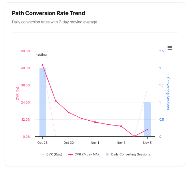
When you select a specific conversion path in your filters, a line chart appears showing:
- A pink line representing your conversion rate over time
- Blue bars showing the volume of converting sessions each day
- Interactive data points that reveal detailed information when you hover over them
- A smoothed trend line that helps you spot patterns more easily
The chart automatically adjusts to your selected date range and updates whenever you change your filters.
Understanding the Chart
The Main Elements
Conversion Rate Line (Pink) This is your primary metric – the percentage of sessions that resulted in a conversion on each day. You'll actually see two pink lines:
- A lighter, thinner line showing the raw daily conversion rate (more volatile)
- A darker, bolder line showing the 7-day moving average (smoother, reveals true trends)
Why two lines? Daily conversion rates can jump around quite a bit due to random variation, especially if you don't have massive traffic. The 7-day moving average smooths out these daily fluctuations to show you the real trend.
Converting Sessions Bars (Blue) These bars show how many sessions converted each day. They appear translucent so you can focus on the trend line whilst still seeing volume context.
Why this matters: A high conversion rate with low volume might just be luck. A high conversion rate with high volume is genuine success!
How to Read the Chart
The Vertical Axes
Left Axis (Pink Numbers) Shows the conversion rate as a percentage. This is your efficiency metric – what proportion of your sessions are converting.
Right Axis (Blue Numbers) Shows the count of converting sessions. This is your volume metric – how many successful interactions you had.
The Horizontal Axis
Shows your timeline, with dates automatically formatted based on your selected range:
- Short ranges (7-30 days): Shows individual days
- Longer ranges (60-120 days): May group by weeks or months for clarity
Interpreting the Trend Line
Upward trending: Your conversion rate is improving ✓
- More sessions are converting
- Your optimisation efforts are working
- Keep doing what you're doing!
Downward trending: Your conversion rate is declining ✗
- Fewer sessions are converting
- Something may have changed (website, traffic quality, competition)
- Time to investigate and address the issue
Flat/stable: Your conversion rate is consistent →
- Predictable performance
- May indicate you've hit a plateau
- Consider testing new optimisations
Volatile/spiky: Your conversion rate jumps around ⚡
- Common with lower traffic volumes
- Look at the smoothed line for the real trend
- May indicate day-of-week patterns
Interactive Features
Hover for Details
When you hover your mouse over any point on the chart, a detailed tooltip appears showing:
Primary Metrics (Session-Level)
- Converting Sessions: Number of sessions that converted that day
- Total Sessions: Total number of sessions that day
- CVR (7-day MA): The smoothed conversion rate for that point
- Raw CVR: The actual conversion rate for just that one day
Additional Context (When Relevant)
If visitors had multiple converting sessions:
- Unique Converters: How many individual visitors converted (visitor-level view)
- An explanation noting that some visitors returned and converted again
If sessions had multiple conversion events:
- Total Conversion Events: How many conversion actions occurred
- An explanation noting that some sessions converted multiple times
If the path has monetary value:
- Revenue: Total revenue generated that day
Example tooltip:
28th October, 2025
● CVR (7-day MA): 4.25%
○ Raw CVR: 4.8%

✅ Session-Level (Primary):
● Converting Sessions: 127
● Total Sessions: 2,646

👤 Visitor-Level (Context):
● Unique Converters: 124 visitors
  (Some visitors had multiple converting sessions)

💰 Revenue: £3,847
Export Options
Click the menu icon (three horizontal lines) in the top-right corner to:
- View Fullscreen: Expand the chart to fill your entire screen
- Download as Image: Save as PNG, JPEG, PDF, or SVG
- Download Data: Export as CSV or Excel spreadsheet
Perfect for:
- Adding charts to presentations
- Sharing insights with stakeholders
- Conducting offline analysis
- Creating reports
Understanding Session-Level vs Visitor-Level Metrics
This is important! The chart uses session-level counting as the primary metric, which aligns with the KPI dashboard and provides more accurate conversion insights.
Session-Level Counting (Primary)
What it means: Counts each converting visit once, even if that visit had multiple conversions.
Example: Sarah visits your site and purchases three products. That's:
- 1 converting session (counted once)
- 3 conversion events (not the primary metric here)
Why it's primary: Session-level counting gives you a true picture of how many visits were successful, which is what most businesses care about when measuring conversion rate.
Visitor-Level Counting (Context)
What it means: Counts unique individuals who converted, regardless of how many times they visited.
Example: John visits on Monday and converts. He returns on Wednesday and converts again. That's:
- 2 converting sessions (the primary metric)
- 1 unique converter (shown for context)
Why it's shown: When these numbers differ, it tells you that some customers are returning to convert multiple times – which is actually good news! It indicates strong product-market fit and customer satisfaction.
When the Numbers Differ
Converting Sessions > Unique Converters:
- Good sign! You have loyal customers making repeat purchases
- Some visitors found your offer so compelling they came back
- Your remarketing or loyalty programmes may be working well
Example:
- 150 converting sessions
- 130 unique converters
- Interpretation: 20 people converted twice within the period
The 7-Day Moving Average Explained
What Is It?
Instead of showing just the conversion rate for a single day (which can be erratic), the moving average shows the average conversion rate over the past 7 days for each point.
Simple example:
- Day 7 shows: (Day 1 + Day 2 + Day 3 + Day 4 + Day 5 + Day 6 + Day 7) ÷ 7
- Day 8 shows: (Day 2 + Day 3 + Day 4 + Day 5 + Day 6 + Day 7 + Day 8) ÷ 7
- And so on...
Why Use a Moving Average?
Without smoothing:
- Monday: 8.2% CVR (big order came in)
- Tuesday: 2.1% CVR (slow day)
- Wednesday: 4.5% CVR (normal)
- Result: You can't see the real trend through all the noise
With 7-day smoothing:
- All three days show approximately 4.9% CVR
- The actual trend becomes visible
- You can make better decisions
When to Focus on Each Line
Use the raw line (light pink) when:
- You want to see day-to-day variation
- You're investigating a specific date or event
- You have very high traffic volume (thousands of sessions per day)
Use the smoothed line (dark pink) when:
- You want to understand the overall trend
- You're making strategic decisions
- You have moderate traffic volume (hundreds of sessions per day)
- You're reporting to stakeholders
Practical Use Cases
1. Measuring Campaign Impact
Scenario: You launched a new marketing campaign on 15th October.
How to use the chart:
- Look at the trend before 15th October (your baseline)
- Look at the trend after 15th October (the campaign period)
- Compare the conversion rates
What to look for:
- CVR increased: The campaign is bringing quality traffic ✓
- CVR decreased: The campaign is bringing poor quality traffic ✗
- CVR stable but volume increased: More traffic at same quality (still good!)
2. Identifying Day-of-Week Patterns
Scenario: You suspect weekends perform differently than weekdays.
How to use the chart:
- Look at a 30+ day range
- Examine the peaks and troughs in the raw CVR line
- Count the days between peaks
What to look for:
- Peaks every 7 days suggests a day-of-week pattern
- Weekend dips might indicate a B2B product
- Weekend spikes might indicate a consumer product
Action: Adjust your marketing spend or promotions accordingly.
3. Detecting Website Issues
Scenario: Your conversion rate suddenly drops.
How to use the chart:
- Identify exactly when the drop started
- Check what changed on that date
- Investigate potential causes
Common culprits:
- Website updates or redesigns
- Checkout process changes
- Price increases
- Technical problems (slow loading, broken forms)
- Increased competition
- Search engine algorithm changes
Quick diagnostic:
- If volume dropped too: Traffic problem
- If only CVR dropped: Website or offer problem
4. Evaluating A/B Tests
Scenario: You're testing a new checkout flow that went live on 1st November.
How to use the chart:
- Note the conversion rate before 1st November
- Monitor the smoothed line after 1st November
- Give it at least 7-14 days for the moving average to fully reflect the change
What to look for:
- Clear upward trend after the change date: Test is winning ✓
- Downward trend: Test is losing, consider rolling back ✗
- No change: Inconclusive, may need more time or traffic
5. Seasonal Planning
Scenario: You're planning for the holiday season and want to understand typical patterns.
How to use the chart:
- View a 90-120 day range
- Look for recurring patterns or cycles
- Note when your peak conversion periods occur
What to look for:
- Build-up periods before major holidays
- Post-holiday slumps
- Monthly patterns (payday effect?)
- Quarterly cycles
Action: Plan inventory, staffing, and marketing budgets around these patterns.
6. Understanding Customer Behaviour Changes
Scenario: Your business model is subscription-based with monthly renewals.
How to use the chart:
- Monitor conversion rates around renewal dates
- Look for monthly cycles in the data
What to look for:
- Spikes at renewal times (good retention)
- Drops after renewal dates (customer fatigue?)
- Increasing trend (growing loyalty)
- Decreasing trend (churn risk)
Common Patterns and What They Mean
Pattern 1: Steady Upward Trend
What it looks like: The smoothed line consistently rises over weeks
What it means:
- Your optimisation efforts are working
- Traffic quality may be improving
- Product-market fit is strengthening
- User experience improvements are having an impact
Pattern 2: Steady Downward Trend
What it looks like: The smoothed line consistently falls over weeks
What it means:
- Something has changed for the worse
- Increased competition
- Seasonal decline
- Technical or user experience issues
- Traffic quality deterioration
Pattern 3: Sudden Spike (One-Time Jump)
What it looks like: A sharp one-day peak in the raw CVR line
What it means:
- One-off event (influencer mention, media coverage)
- Very small traffic volume that day (a few conversions appear as high %)
- Data anomaly
- Successful flash sale or promotion
Pattern 4: Sudden Drop (One-Time Fall)
What it looks like: A sharp one-day dip in the raw CVR line
What it means:
- Website outage or technical issue
- Major competitor promotion
- Ad campaign paused or ended
- Weekend/holiday effect
- External event affecting your market
Pattern 5: Plateauing (Flat Line)
What it looks like: The smoothed line stays flat for weeks despite your efforts
What it means:
- You've hit your current conversion rate ceiling
- Your traffic mix is stable
- No major changes in competition or market
- You've optimised the easy wins
Pattern 6: Weekly Cycles (Regular Ups and Downs)
What it looks like: The raw CVR line peaks and troughs every 7 days
What it means:
- Strong day-of-week patterns
- Different customer behaviour on different days
- Business hours vs leisure time conversions
Pattern 7: Volatility (Erratic Jumping)
What it looks like: The raw CVR line moves wildly up and down with no pattern
What it means:
- Low traffic volume (small sample sizes)
- Inconsistent traffic quality
- No clear patterns in customer behaviour
- Possible bot traffic or data quality issues
Chart Annotations
What Are Annotations?
Annotations are small labels that appear on your chart to mark important events or dates. They help you correlate changes in conversion rate with specific actions you've taken.
Examples of useful annotations:
- "New homepage launched"
- "Price increase"
- "Christmas sale started"
- "Email campaign sent"
- "Competitor launched similar product"
- "Algorithm update"
How They Appear
When annotations are enabled for the chart context, you'll see:
- Small text labels above specific dates
- White background with light grey borders
- Ability to drag and reposition them if they overlap
- Tooltips showing full descriptions when you hover
Why They're Valuable
Without annotations: "Why did our conversion rate jump on the 15th?" Spends 30 minutes digging through emails and calendars
With annotations:Hovers over 15th, sees "Email campaign launched" "Ah, that's why! The email campaign worked well."
Managing Annotations
Annotations are managed at the account level and can be:
- Enabled or disabled for specific chart contexts
- Set to show site-wide or for specific keywords/paths
- Added retrospectively to explain historical changes
Troubleshooting Common Issues
Issue: Chart Shows "Select a path to view conversion rate trend"
Cause: No conversion path is currently selected in your filters.
Solution:
- Look at the filter bar at the top of your dashboard
- Click the "Path" dropdown
- Select a specific conversion path
- The chart will load automatically
Why this happens: The chart is path-specific, so it needs to know which conversion goal to analyse.
Issue: Chart Shows "No CVR data available for this date range"
Cause: No conversions occurred for the selected path during your chosen time period.
Solution:
- Try expanding your date range (e.g., from 7 days to 30 days)
- Check if the path was active during this period
- Verify that tracking is working correctly
- Consider that this might simply indicate a new path with no conversions yet
Issue: Chart Shows "No meaningful CVR data available"
Cause: There were conversions, but no visitor/session data to calculate a conversion rate.
Possible reasons:
- Tracking implementation issues
- Data not yet processed
- Cookie tracking disabled and insufficient data
Solution:
- Wait a few hours for data processing
- Check your tracking code implementation
- Contact support if the issue persists
- Verify that your date range includes enough data
Issue: Conversion Rate Looks Too High (80%+)
Likely cause: Very low traffic volume making the percentage misleading.
Example:
- 8 conversions out of 10 sessions = 80% CVR
- But this is just 10 sessions total!
Solution:
- Hover over the high points to see actual numbers
- Focus on days with higher volume for reliable metrics
- Use longer date ranges to get more stable percentages
- Don't over-interpret single days with low traffic
Issue: Conversion Rate Looks Too Low (<0.5%)
Check these factors:
- Is this truly a problem?
- Some industries have naturally low conversion rates
- High-value B2B products may convert at <1%
-
Compare to your historical baseline, not industry averages
Traffic quality issues:
- Use the Campaign filter to segment by source
- Check for bot traffic or irrelevant visitors
-
Review your targeting and keywords
Technical problems:
- Test your conversion forms on different devices
- Check page loading speeds
- Verify that tracking code is working
-
Look for broken links or errors
User experience issues:
- Is your value proposition clear?
- Are there too many steps to convert?
- Is pricing clearly displayed?
- Do you have trust signals (reviews, guarantees)?
Issue: Raw and Smoothed Lines Are Very Different
This is normal! It means:
- You have natural day-to-day variation in your conversion rate
- The smoothing is working correctly to show you the trend
- Your traffic volume varies throughout the week
What to do:
- Trust the smoothed line for trend analysis
- Use the raw line only for investigating specific dates
- Consider increasing traffic for more stable metrics
Issue: The Chart Isn't Updating
Quick fixes:
- Hard refresh your browser:
- Windows: Ctrl + F5
-
Mac: Cmd + Shift + R
Check your filters:
- Ensure a path is selected
- Verify your date range includes recent dates
-
Check that domain filter is appropriate
Data processing delay:
- Recent data (last 24 hours) may still be processing
-
Try looking at yesterday's data instead
Browser issues:
- Try a different browser
- Clear your cache
- Disable browser extensions that might interfere
Frequently Asked Questions
Q: Why does my CVR change when I select a different path?
A: Each conversion path has its own conversion rate because they require different levels of commitment. A newsletter signup (low commitment) will naturally have a higher CVR than a £500 purchase (high commitment).
Q: Should I be concerned about daily volatility in the raw CVR line?
A: Not usually. Day-to-day variation is normal, especially with moderate traffic volumes. Focus on the smoothed 7-day moving average line for trend analysis.
Q: What's a "good" conversion rate?
A: It depends entirely on your path type, industry, and traffic source. Don't obsess over industry benchmarks. Instead, focus on improving YOUR baseline, whatever it is. A move from 2% to 2.3% is a 15% improvement – that's excellent regardless of industry averages.
Q: Why is the converting sessions count different from my conversion events?
A: Because one session can have multiple conversion events. If someone purchases three items during one visit, that's three events but only one converting session. We count sessions because it better represents the number of successful visits.
Q: Can I compare this chart across different paths?
A: You can't view multiple paths simultaneously on one chart, but you can switch between paths using the filter and mentally compare. Better yet, export screenshots of each path's chart for side-by-side comparison.
Q: Why do I sometimes see "unique converters" in the tooltip?
A: This appears when the number of unique visitors who converted differs from the number of converting sessions. It tells you that some visitors converted multiple times during the period, which is actually good news!
Q: How often does the chart update?
A: Data is typically processed within a few hours of conversion events occurring.
Q: Why can't I see my chart from before my tracking was installed?
A: The chart can only display data for periods when tracking was active. If you installed tracking on 1st October, you won't see data from September.
Q: What's the best way to measure the impact of a website change?
A:
- Note your baseline CVR for at least 14 days before the change
- Make your change and add an annotation on that date
- Monitor the smoothed line for at least 14 days after
- Compare the before and after averages
- Ensure your traffic volume is similar in both periods
Q: Can I download the raw data behind the chart?
A: Yes! Use the export menu (three horizontal lines icon) and select "Download CSV" or "Download XLS" to get the full dataset including dates, conversion rates, sessions, and revenue.