Conversion KPIs
The Conversion Performance KPIs provides five key metrics that help you understand how visitors interact with your website and complete desired actions (conversions). This guide explains each metric in simple terms and shows you how to use them to improve your business results.
What You'll See
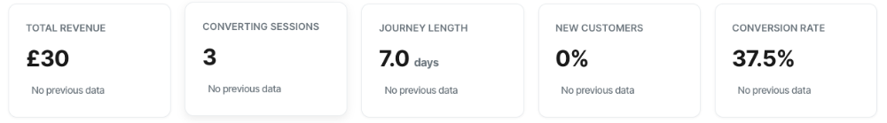
At the top of your dashboard, you'll find five metric cards displaying:
- Total Revenue
- Converting Sessions
- Journey Length
- New Customers
- Conversion Rate
Each card shows:
- The current value for your selected time period
- A trend indicator (↑ or ↓) showing how this compares to the previous period
- A percentage change from the previous period
The Five Key Metrics Explained
1. Total Revenue
What it shows: The total monetary value generated from all completed conversions during your selected time period.
Why it matters: This is your bottom line – the actual money your website is generating. It's the most direct measure of your online success.
How to interpret it:
- The currency symbol adapts automatically based on your conversion path settings (USD $, GBP £, EUR €, etc.)
- Numbers are formatted for easy reading (e.g., $12,345 instead of $12345.00)
- Look for the trend arrow: ↑ means revenue increased compared to the previous period, ↓ means it decreased
Example: If you see "$15,280" with "↑ 23% vs last period," your revenue increased by 23% compared to the previous time frame.
What to do with this information:
- Celebrate when it's up! Your conversion efforts are working
- When it's down, review what changed: Did traffic decrease? Did ad campaigns end? Did you change pricing?
- Compare revenue trends with converting sessions to understand if you're earning more per customer or just getting more customers
2. Converting Sessions
What it shows: The number of website visits (sessions) that resulted in at least one conversion.
Important to know: This metric counts each converting session once, even if that session included multiple conversions. For example, if someone buys three products during one visit, that counts as one converting session.
Why it matters: This tells you how many successful interactions you had with visitors. It's a measure of your website's ability to turn browsers into buyers.
How to interpret it:
- A higher number means more visits are ending in success
- Look at the trend to see if your conversion efforts are working
- Compare this with Total Revenue to understand average order value
Example: If you see "847" with "↑ 15% vs last period," you had 847 sessions where someone converted, which is 15% more than before.
What to do with this information:
- Rising converting sessions = your website is resonating with more visitors
- Falling converting sessions might indicate issues with user experience, pricing, or targeting
- Use filters to identify which campaigns or devices are driving the most converting sessions
3. Journey Length
What it shows: The average number of days between a visitor's first interaction with your website and when they converted.
Why it matters: This reveals how quickly people make purchase decisions. Some products sell immediately, others require days or weeks of consideration.
How to interpret it:
- Lower numbers (0.1-2 days) = Fast decision-making, impulse purchases, or low-commitment offers
- Higher numbers (7-30+ days) = Longer research period, considered purchases, or complex buying decisions
- "same-day" means most conversions happen during the visitor's first session
- A downward trend (↓) is actually good – it means people are deciding faster
Example: If you see "3.2 days" with "↓ 18% vs last period," the average customer now takes 3.2 days to convert, down from about 3.9 days previously.
What to do with this information:
- Short journey lengths suggest your offer is compelling and easy to understand
- Long journey lengths might indicate you need stronger remarketing, clearer value propositions, or simplified purchasing
- Use this to plan email sequences and retargeting campaigns (if people take 7 days on average, make sure you're staying in touch during that window)
4. New Customers
What it shows: The percentage of conversions that came from first-time customers (people who have never converted on your website before).
Why it matters: This helps you understand whether you're growing your customer base or relying heavily on repeat purchases.
How to interpret it:
- 80-100% = You're primarily acquiring new customers (growth mode)
- 50-79% = Healthy mix of new and returning customers
- Below 50% = You're heavily dependent on repeat business
Example: If you see "73%" with "↑ 5% vs last period," 73% of your conversions came from first-time buyers, which increased by 5 percentage points.
What to do with this information:
- High new customer percentage = strong acquisition, but watch for customer retention issues
- Low new customer percentage = great loyalty, but you may need to focus on attracting new audiences
- A sudden drop might indicate your new customer acquisition channels are underperforming
- A sudden increase might mean a successful campaign brought in fresh audiences
5. Conversion Rate
What it shows: The percentage of all sessions that resulted in a conversion. Calculated as: (Converting Sessions ÷ Total Sessions) × 100
Important to know: This is calculated at the session level. If you've filtered to a specific conversion path, it shows the percentage of sessions that started that path and completed it.
Why it matters: This is arguably the most important metric for optimisation. It tells you how effective your website is at converting visitors into customers.
How to interpret it:
- 1-3% = Average for most e-commerce sites
- 3-5% = Good performance
- 5%+ = Excellent performance (though this varies by industry)
- Higher is always better, but compare against your own baseline, not just industry averages
Example: If you see "4.2%" with "↑ 12% vs last period," 4.2% of your sessions resulted in conversions, which is 12% better than the previous period.
What to do with this information:
- Rising conversion rate = Your optimization efforts are working
- Falling conversion rate might indicate technical issues, poor traffic quality, or competitive pressure
- Use device and campaign filters to identify where your conversion rate is strongest or weakest
- Focus optimisation efforts on high-traffic, low-conversion areas for maximum impact
Understanding Trend Indicators
Every metric includes a trend indicator that compares your current period to the previous equivalent period:
Trend Types:
↑ Green Arrow with Percentage
- Your metric improved compared to the previous period
- Example: "↑ 23% vs last period" means you're up 23%
↓ Red Arrow with Percentage
- Your metric decreased compared to the previous period
- Example: "↓ 15% vs last period" means you're down 15%
Gray Dash (—)
- "No previous data" = This is your first time period with data
- "New activity" = Activity just started in this period
Note on Journey Length: For this metric only, a downward trend (↓) is actually positive because it means customers are converting faster!
Using the Filters
At the top of your dashboard, you'll find several filters that let you slice your data different ways:
Date Range
Choose from:
- Last 7 days
- Last 30 days
- Last 60 days
- Last 90 days
- Last 120 days
Tip: Longer date ranges provide more reliable trends but may hide recent changes. Shorter ranges show immediate impact but can be more volatile.
Domain
If you track multiple websites, select which one to analyze. Choose "All Domains" to see combined performance.
Path
Filter to a specific conversion path (e.g., "Product Purchase" or "Newsletter Signup"). Choose "All Paths" to see all conversions combined.
When to use this:
- Compare performance across different conversion goals
- Identify which paths are performing best
- Troubleshoot specific conversion funnels
Campaign
Filter by UTM campaign parameter to see how specific marketing campaigns perform.
Options include:
- Specific campaign names (from your UTM tracking)
- "(no campaign)" to see organic/direct traffic
- "All Campaigns" for combined view
When to use this:
- Measure ROI of specific marketing initiatives
- Compare paid vs. organic performance
- Identify which campaigns drive highest-quality traffic
Common Questions
Q: Why do my Converting Sessions not match my conversion events?
A: Converting Sessions count unique visits that converted, while conversion events count every action. If someone purchases three items in one visit, that's three events but one session.
Q: What if I see a dash (—) instead of a percentage?
A: This means there's no previous data to compare against, either because you just started tracking or because there was no activity in the previous period.
Q: How is the conversion rate calculated differently for paths vs. site-wide?
A:
- Site-wide: Total converting sessions ÷ Total sessions (all visitors)
- Path-specific: Sessions that completed the path ÷ Sessions that started the path (entered at step 1)
Q: Why don't I see revenue for some conversions?
A: Some conversion paths may not have monetary values assigned (like newsletter signups). Only paths with revenue tracking will contribute to the Total Revenue metric.
Q: What's the difference between "cookie tracking enabled" and "cookieless" mode?
A:
- Cookie tracking enabled: Uses browser cookies to track users across sessions and devices, providing complete journey data
- Cookieless mode: Limited to single-session tracking, which may affect metrics like Journey Length and New Customers
Metric Methodology Reference
Important: All conversion metrics use session-level counting. A "converting session" is a visit that completed at least one conversion, counted once regardless of how many times it converted during that session.
This approach provides:
- More accurate visitor behavior insights
- Clearer understanding of engagement quality
- Better alignment with analytics industry standards
Tips for Getting the Most Value
1. Set Your Baseline
Check your metrics over a 30-day period to establish normal performance. Use this as your benchmark for future comparisons.
2. Look for Patterns
- Compare weekday vs. weekend performance
- Identify seasonal trends
- Watch for campaign impact
3. Segment Your Data
Use filters to understand:
- Which devices convert best?
- Which campaigns drive quality traffic?
- Which products/paths perform strongest?
4. Focus on Trends, Not Single Data Points
One bad day doesn't mean failure. Look at week-over-week or month-over-month trends for meaningful insights.
5. Combine Metrics for Deeper Insights
- Revenue ↑ + Converting Sessions ↑ = Healthy growth
- Revenue ↑ + Converting Sessions → = Higher value per customer
- Revenue → + Converting Sessions ↑ = More customers, but lower value per transaction
- Conversion Rate ↑ + Journey Length ↓ = More efficient conversion process